Monday, December 23, 2013

Turquoise is a fun color.

I have been obsessed with it lately. It just contrasts and compliments so many other colors so well because its not quite green but its not quite blue.

Anyway, this is just a quick update. Got this done for a friend. Last one finished before Christmas! Whoo!

Saturday, December 14, 2013

Kawaii Desu~~

Super Dungeon Explore's miniatures are just way too damn cute and I love them.

Note the bases are not painted on a few of them. Reason being last Thursday when I was working on these, I painted the ones people wanted to use in our game while one of the players was in the middle of his Warhammer match. Figured I'd just get through as many as possible.

Also turns out I found a technique I like a lot. When you base things with a pure white primer, applying washes directly to it can give you really neat bright color effects for utilizing shaded hair, cloth and the like. I did it with both the Riftling Rogue's hair by washing it purple and the Glimmerdusk Ranger's shawl by washing it turquoise. Was simply a matter of reapplying white highlights afterward, and boom. Done.

Their eyes are a llittle more complicated than I'd done on any other model because they are so large and unlike the Druid, weren't just little beady black slats. Ideally I aim for something similar to this with the more realistic models I do truth be told. Putting color in the bottom half and applying a white tiny dot in the top of the pupil goes a llong way toward making eyes look realistic. Its cartoony here because of the eyeball size in relations to the rest of the head but it works great when you can pull it off with more realistic miniatures. Give it a try!

Monday, December 9, 2013

Busy!

I've been so swamped, I haven't had time to update my blog. The worst part is, I didn't even remember to take photos of some of the things I've done recently and that is quite sad indeed.

So we'll just skip to what I'm doing now. The guy I did the purple marine for, with the jetpack and wing helm? I am doing up all his miniatures for this really awesome board game called "SUPER Dungeon Explore!" I am totally in love with the game and the game's pieces.

The first guy I decided to work on was the Druid guy because he was my favorite of the two I played as in our game. Also he is technically two models as he can turn into a bear, which is my next project.

First off, painting chibi anime figures is a trip. Throw out all you know about highlighting 40k minis. To make it look cartoony, you have to do most of it yourself instead of letting the different types of paints do the lions share of the work. I only used shade paints on the skin to darken up his joints and the key Sepia wash on the fur to make it look mote organic than if I'd washed it black like I usually do with white. It was a straight sepia wash twice to darken up the fur, as I'd primed the model white. I love the results.

I can't wait to do the rest of the set!

Tuesday, November 26, 2013

Banner for the Banner God

Occasionally I do things that make me sit back and wonder when I developed the skills to do certain things. That's the fun of continually pushing yourself and trying new things every.chance you get. Practice makes perfect, as the saying goes.

If you told me last year, I'd be good enough to paint in par with the 'Eavy Metal team over at GW, I'd have said you were crazy. But I really feel like my guys are at least the quality you see on the boxes and you really can't ask for much more without better tools (like, say, an airbrush) and more time and money than I can currently devote to the hobby.

This particular mini, I did for my friend Erik. The Khorne icon on the banner is freehand. Layering up browns into yellows to create the illusion of gold is challenging, and rewarding. First, paint the entire outline, inside and out, with your darkest brown. I use Rhinox Hide. Next, skip over to a light dustier brown (I used Baneblade Brown for this) leaving just enough of the really dark parts where you want the object to have shadows. Freehanding is actual art, unlike most skills actually utilized in painting miniatures. Those shadows you have to create yourself. No wash to bail you out now.

Next, use a brown that has some orange to it. I utilized Tau Light Ochre for this, and now you have to really pay attention to what you want to be pure shadow or not. At this point, you can jump into the yellow shades and apply upward like normal (Averland Sunset -> Yriel Yellow -> Flash Gitz Yellow), with a final highlight of white along the edges you want to look like they are glinting, as well as in corners and behind edges that are super dark to create a backlit effect. The first time I tried doing this technique, I didn't realize how important that white behind the darker parts was in creating a full metallic effect. If you ever try this out yourself, just give it a shot and hopefully you'll see for yourself.

Friday, November 22, 2013

The abominable snowman (who is actually a snow man)

Next stage of project Christmas 2013 is complete. My friend Roger has been collecting miniatures for years and years and years, so he has this hodgepodge of weird, random, unfinished and unpainted stuff. This was one of said miniatures.

Its actually Christmas themed so I think I sort of kind of really majorly love it.

Also: blame the slight yellowish tinge on my light and the fact its on a background more pure white than it. It is not that way at all in person, I promise.

Wednesday, November 20, 2013

Drazhar, the Fallen Phoenix Lord

So, next Christmas gift painting all done. Well. 95% done. I still have to do the base but like with a few of my previous models done for friends, I haven't discussed all the details yet. Last guy I did for this particular friend, he still didn't know how he wanted to base his army so I left this blank for now.

The lore for this guy is pretty cool. He just showed up one day in the dark Eldar world and just killed a bunch of dudes, then killed a really important dude, and simply bowed to the audience as they made him leader of the Incubi, which are elite warrior type dudes. Fun fact: he never said a word. Think the creepy clockwork dude from the first Hellboy.

Rumors persist he's the original Phoenix Lord for the Eldar Striking Scorpions aspect warriors. Gameplay suggests it as he functions very similarly to the current striking scorpion lord. Same stat line, same end goal of how you'd run him on the table. Good guys who break bad are always the best.

Sunday, November 17, 2013

Christmas Gifts!

Welp, looks like I got my first miniature done as a Christmas gift done up quickly. I worked on it a lot last night, so that's why. Make sure you go read my previous post before this one, seeing as I published it like two hours ago or something. Productivity comes in waves, I swear.

This guy was a blast to kit bash. Zack and I spent maybe 30 to 45 minutes just rummaging through parts to come up with the idea for this guy, which is to say captain of his 8th company. He is going with a pre-heresy Emperor's Children color scheme, and is saying its a faction of that chapter who remained loyal, and is therefore Codex Astartes compliant. (If you are reading this and lost, don't worry. This is legit nerd stuff.)

Their symbol was a wing that ended in a claw. I realized awhile ago many symbols on my Ravenwing guys were essentially that because whenever they had the eagle wing on something not holding the sword that usually part of the symbol, it ended up looking like exactly that. We took the helmet out of the Ravenwing Command Squad box and you'll notice its the same as the one my champion is wearing from a few posts prior.

The claw and hammer set up was Zack's idea as he just liked the weapon combination. Its pretty nasty on the table top because it turns him into an all-comers close combat warrior. Its also extremely costly points wise, but hey cool captains are more important to imagine than to actually run. We searched high and low in his Vanguard Veterans box and grey knights kits to find the rest of the gear, I believe. His right shoulder was out of the Sternguard Veterans box, and we're not even sure where the Mk6 studded shoulder on the other side came from as it was half painted already when we put it on. Basically, anything with an Aquila or that looked like it'd be pretty in gold, we put on him. The emperor's children turned to chaos out of their own pride so making sure his captains are really coordinates and gaudy was important.

For the base, I thought it'd look cool if he was at the highest point on an outcropping of rock, as if he was about to leap. It looks great, but I fear it wont last. The cork board I use for rock looks great, but is really flimsy so there is a good chance it breaks some day. Plus, posing him this way made the model extremely top heavy so I had to glue two washers to the bottom for weight instead of my usual just one.

Still, I think the end result speaks for itself. The only thing I want to add is his name on the scroll on his right shoulder and something else on the white part on his right leg, but my thinnest brush is not holding a point very well anymore and I also need to talk with Zack about what we're going to name him.

Next up: Drazhar, Dark Eldar inccubi bad-ass.

Ravenwing Apothecary

All my command squad specific black knights are officially done! Yay!

I tell you what, I never want to paint up an entire dude in white like this ever again, ever. Getting it smooth was extremely time consuming and one of the most challenging things I've done as an artist so far.

First issue is I primed him black. That's not a BAD thing to do for the model because the majority of the bike is black, and I've primed all the other bikers black so golds, reds, and whatever other color will go along better with his other squadies when its all said and done. However it means doing large areas of white were going to suck. I had to layer upon layer of my white grey (Celestra Grey in the citadel line) just to make the white base smooth. Then came the black wash, which is pretty standard.

Then came layer upon layer of thinned out off-white Ulthuan Grey. Its the majority of what you see and most people associate it as simply "white" but the reason I do not is because pure white is a totally different thing. I had to use the pure white to edge to make his detail pop.

It was extremely time consuming. But ultimately worth it as the eend result speaks for itself.

Lastly, we've got his tubes of liquids. Making them seem like glass was a challenge. I'd done a few glass like tubes before and they were alright but I wanted a more complete effect. I had to repaint all of the ttubes solid black, as paint from edging the whites and reds close by had spilled. Then I simply watered down the color I wanted in the tubes and built up to lighter shades as normal. I left anywhere between 10 to 75% of the tubes black still, to give the illusion not all his tubes were full. Then, leaving a thin black line in between, I used my two brightest blues, same color I do for painting energy on weapons. (Teclis and Lothern by name).

Then, using Lothern blue, I made as small a streak down the tubes as possible, from the glassy looking blues directly into the colored part. Follows that up with an even thinner streak of white, and Viola, glass with streams of light down the sides. On the larger tubes on his backpack, I made two such streaks per tube trying to make one shorter than the other. My friend Roger who is easily the best painter alongside myself at our local hobby center loved it more than any other part of the model so I must have done something right.
Enjoy! Til next time, me amigos. Expect lots of non-space marines and just random minis in the coming weeks. I don't have much to give but my time and talents for my friends this year so I am doing a miniature apiece for all of them, starting with that sniper from last post. I have made a lot of friends this year so I knew I needed to start soon! Thanks for the support, everyone.

It reads "Vitae Mortis" which is latin for "Life" and "Death" respectively.

Monday, November 11, 2013

Elves, in space!

Did this guy for a friend who lost his job. I wanted to cheer him up. He's partially lucky he just happens to be running the army I wish I was, but also he's a good dude anyway.

The base was fun. Its funny how my favorite parts of the model go unnoticed. I blended my most desaturated brown with grey to do the vines on the ruins he's standing on to make them look brittle and dead. I suppose the fact everyone is too busy looking at the camp cloak means I must have done that part right.

Wednesday, November 6, 2013

Productivity!

I guess after how awesome my Ultramarine came out, I feel reinvigorated to just paint things so I started working on my backlog. Here is the standard bearer for my biker squadron, and an evil wizard guy.

The biker's flag I finished well over a month ago, but I never got around to actually painting any of my black knights, as the unit is called. Shame really, because are my favorites. 5 more to go!

The wizard was a mini I picked up awhile ago, back when Game Haven picked up a box of plastic Reaper minis. I had been meaning to join a DnD campaign but real life got in the way and so too did painting up this guy. Glad I got him done now because he's very fun and swell to be around.
 

Friday, November 1, 2013

Space Marine painting competition - Entry Final

Welp, here is it. Finished product. Going to take it down to the hobby store tomorrow to get it officially entered into our little painting competition.

Leave comments! Tell me what you think. Ask questions! Let's get some some interaction going here.

Thursday, October 31, 2013

Space marine painting competition part 2

Well, the hard part is done. I absolutely love how he's turning out. Very glad I decided to go Ultramarine because the blue of their armor clashes so well with the orange glow effect I was trying to create.

To do the shoulders, I based it with a very muddy dark brown, then to do the streaks of light I went from a lighter brown to ochre, to yellow, then with that yellow I continually added and applied white to it until finally using pure white itself. Having a hard time noticing the subtlety between the yellows? Good, it means I did my job.

The darkness of the majority of the model from basing it black and using two washes really helped sell the contrast natural light makes. The knee pads especially look great.

More photos, and with better lighting, to come once I finish the entire thing. Stay tuned!

Saturday, October 26, 2013

Step one of Space Marine painting competition

So my local hobby shop is having a painting competition. I wanted to challenge myself to do something I've never done and that seemed really hard on paper.

So, I wanted to toy with shadows and source lighting. The key to shadows is all in how you think your model is lit. If you want a dim situation, the odd thing is bright colors opposite your base coat end up making the model seem like its underground or in moonlight. Easiest colors to do this kind of complimentary shading with is blue and orange.

The first thing I did with my marine for entry was base it totally black then got out my white primer to lightly spritz the direction I wanted light from the eventually lava themed base to emanate from. When I based my model, anything black was coated with a thin blue (Macraggae Blue), anything white was coated with a forestry green, the kind you get from blending blue and orange together. Lastly, I used the orange I had mixed with the blue for that green shade (Jokaero Orange) inside of where the blend was, attempting a semblance of a blend.

Afterwards, I applied a blue wash over the whole model to tone the orange part down, then went back over the entire model again once that wash dried to achieve the orange shading that my lightsource would bring out. Both washes really helped the BLUE->GREEN->ORANGE blend, as well.

That's currently where I'm at with the model. More to come as I get further!

Thursday, October 17, 2013

TWOFER! Sableclaw + Kairos Fateweaver

Busy week! Let's get into it.

You may have seen images here and there of both these guys either here or on my photobucket or if I just sent it to you as a work in progress over the phone, so let's talk about them all.

First, The Sableclaw. It's the landspeeder variant driven by Sammael, meaning a mechanized HQ. Mostly, I figured I'd rig it this way so if I wanted to run it as him, I could, and if I wanted to just run it as a regular landspeeder and declare his weapons weren't twinlinked, no one would be too butthurt about it.

Fly me over there so I can hit them with my sword! - Sammael

I specifically left this a little darker than I usually do because I wanted it to look scuffed and worn down, like it's seen a lot of battle (because it has, fluff-wise.) I didn't do anything too fancy with paints, using my usual compliments of blacks and reds and whites.


The face of the pilot (so Sammael, I guess) was a head taken out of the Ravenwing Command Squad kit, as was the sword. I think. Maybe I got the sword out of a different box, I legitimately can't remember anymore. The pilot, I decided I'd paint as a techmarine mostly because 1) I had the bits for it and 2) It'd be cool. I think it's kind of silly for each weapon to run at ballistics skill 5 if the gunner is just a regular dude, so upping him to be a techmarine (I know they are just BS4, deal with it) seemed cooler. Plus, it let me use a little more red on the model to create a few more highlights.

The book was fun. Fluff-wise, it's a list of all the names of the Fallen successfully hunt down by the Ravenwing. I think I did a mighty fine job with the lettering, especially the big red letters meant to make it seem like beginning of a paragraph.
 

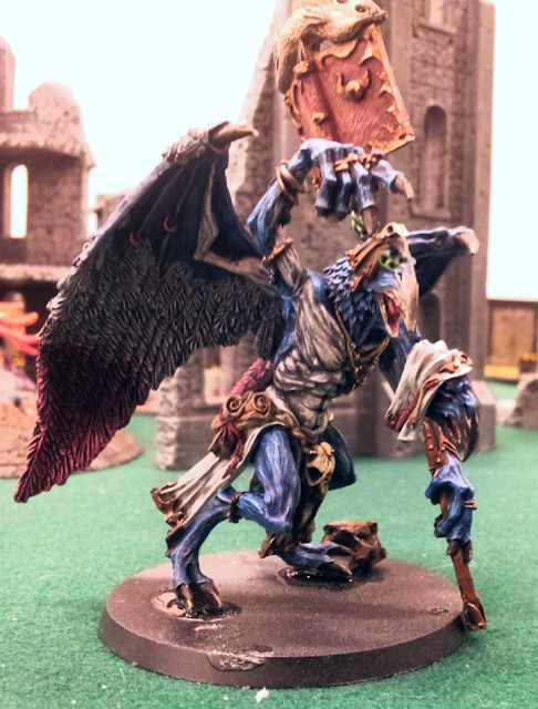
Now that that's out of the way, let's talk about my most recent commission, that of Kairos Fateweaver featured last post. I have the time and photos to talk about it! Also, sorry about the lighting. I had to use just the default shop lights down at the Game Haven as that's where I delivered it to Dirk. Also note, the base is still unfinished but that's something I plan on doing with Dirk present so I can teach him how to do it. (His idea.)

We're going to go through the steps. First was the basecoat and wash.

 Note it's on the base at this point and isn't in the next photo. That's because Dirk had him attached when he gave it to me, and I realized after this stage there's no way I'd be able to paint it as detailed as I wanted while still glued on. Plus, he is new to the hobby and didn't really know how to repose finecast resin safely. The left ankle is kind of messed up. I wish I had noticed it wasn't glued on very well BEFORE putting the base coat on so I could have fixed it, but alas. As for what I did, it was pretty simple. Used Caledor Sky as my base blue, used Rakarth flesh as my underskin. I used the blue wash over the whole thing, to make the underskin parts blend a little better and also to give them a blueish tone.


I think the photo on the right was technically first. In fact, definitely so because his eyes weren't glowing yet. Anyway, getting the rest of him up to this point was a chore. Trying to blend the wings down went better than I envisioned at first. It was just a combination of blending the blue I used to shade the white parts into the red I used to shade the pink parts, before either was dry. I also used a thin glaze of red at the top of the pink part which helped create some bright pink where the white tips touching it were. As for highlighting the wings, entirely done by drybrushing. Drybrushing > rigged surfaces, I'm telling you. Effective, fast, beautiful. It's so easy, a caveman could do it.Only other thing really worth mentioning is before I put the basecoat of gold on, I threw on an undercoat of the same dark brown I used for the beaks. If you struggle with making metallic golds look right, I highly recommend doing this. Gold as it's a really bright color even in it's darkest stages lets a lot of the undercoat shine through. Seeing as you want shadows on gold to be a brown color, it's the perfect undercoat color.

Finished product. You've seen this.

The underskin parts came out excellently. Hyper glad I used the blue wash to do the shading on it, because it totally works. Also, it's hard to tell in this but the head with the hood has purple glowing eyes to contrast with the green in the other head. As it's already on blue, doesn't show up as well in this image.
Also, I had never tried to do the highlighting that I did on the beaks before, and I'm definitely going to try it again in the future. It's just using bone colors as the highlights, with some extra streaks thrown in. Really makes a worn out, old, crusty feel which is just what an ageless bird demon should have, yes?

If you notice, now he's got a rock under his left foot. The way the ankle had set, it just wouldn't go on flat. I figured I'd do what I usually do in this situation and utilize the base to hide the defect. Once I actually get it painted up, it'll look intentional. This is one of the times I'm glad the model is finecast. Because it's such a lighter resin you can do stuff like this and still have a stable model. If this was plastic like the daemon prince kit, it'd just break off. (Something I've actually had happen.)


Last but not least, the spellbook! I had a lot of fun with this. For starters, I used my darkest grey rather than a black to do the lettering as it really helped sell the weathered effect. I also took really, really thin bloody red, purple and blue to do various markings. It's kind of subtle the differences, but it helps a lot.

The fish statue was me trying something new. I had originally undercoated the entire model with black, then went with a white undercoat spray that I just angled up top, hoping it'd help sell a light to dark effect that natural light does. Ended up not mattering (either Kairos isn't big enough or I'm not good enough to make the different undercoats work) but it did leave the fish really white. I used my brightest bronze color, normally used as a highlight. It was super hard to even tell it was there. Basically, perfect. I then used my camo wash (it's a muddy brown/green), then used just drybrushing with my gold and then silver drybrush. It looks like polished brass. I love it. I really do. I am going to utilize this in future works, I promish.