Busy week! Let's get into it.
You may have seen images here and there of both these guys either here or on my photobucket or if I just sent it to you as a work in progress over the phone, so let's talk about them all.
First, The Sableclaw. It's the landspeeder variant driven by Sammael, meaning a mechanized HQ. Mostly, I figured I'd rig it this way so if I wanted to run it as him, I could, and if I wanted to just run it as a regular landspeeder and declare his weapons weren't twinlinked, no one would be too butthurt about it.
Fly me over there so I can hit them with my sword! - Sammael
I specifically left this a little darker than I usually do because I wanted it to look scuffed and worn down, like it's seen a lot of battle (because it has, fluff-wise.) I didn't do anything too fancy with paints, using my usual compliments of blacks and reds and whites.
The face of the pilot (so Sammael, I guess) was a head taken out of the Ravenwing Command Squad kit, as was the sword. I think. Maybe I got the sword out of a different box, I legitimately can't remember anymore. The pilot, I decided I'd paint as a techmarine mostly because 1) I had the bits for it and 2) It'd be cool. I think it's kind of silly for each weapon to run at ballistics skill 5 if the gunner is just a regular dude, so upping him to be a techmarine (I know they are just BS4, deal with it) seemed cooler. Plus, it let me use a little more red on the model to create a few more highlights.
The book was fun. Fluff-wise, it's a list of all the names of the Fallen successfully hunt down by the Ravenwing. I think I did a mighty fine job with the lettering, especially the big red letters meant to make it seem like beginning of a paragraph.
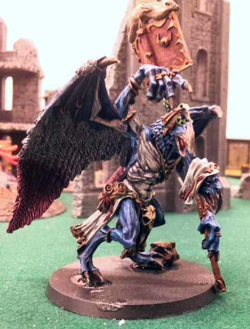
Now that that's out of the way, let's talk about my most recent commission, that of Kairos Fateweaver featured last post. I have the time and photos to talk about it! Also, sorry about the lighting. I had to use just the default shop lights down at the Game Haven as that's where I delivered it to Dirk. Also note, the base is still unfinished but that's something I plan on doing with Dirk present so I can teach him how to do it. (His idea.)
We're going to go through the steps. First was the basecoat and wash.
Note it's on the base at this point and isn't in the next photo. That's because Dirk had him attached when he gave it to me, and I realized after this stage there's no way I'd be able to paint it as detailed as I wanted while still glued on. Plus, he is new to the hobby and didn't really know how to repose finecast resin safely. The left ankle is kind of messed up. I wish I had noticed it wasn't glued on very well BEFORE putting the base coat on so I could have fixed it, but alas. As for what I did, it was pretty simple. Used Caledor Sky as my base blue, used Rakarth flesh as my underskin. I used the blue wash over the whole thing, to make the underskin parts blend a little better and also to give them a blueish tone.

 I think the photo on the right was technically first. In fact, definitely so because his eyes weren't glowing yet. Anyway, getting the rest of him up to this point was a chore. Trying to blend the wings down went better than I envisioned at first. It was just a combination of blending the blue I used to shade the white parts into the red I used to shade the pink parts, before either was dry. I also used a thin glaze of red at the top of the pink part which helped create some bright pink where the white tips touching it were. As for highlighting the wings, entirely done by drybrushing. Drybrushing > rigged surfaces, I'm telling you. Effective, fast, beautiful. It's so easy, a caveman could do it.Only other thing really worth mentioning is before I put the basecoat of gold on, I threw on an undercoat of the same dark brown I used for the beaks. If you struggle with making metallic golds look right, I highly recommend doing this. Gold as it's a really bright color even in it's darkest stages lets a lot of the undercoat shine through. Seeing as you want shadows on gold to be a brown color, it's the perfect undercoat color.

Finished product. You've seen this.
The underskin parts came out excellently. Hyper glad I used the blue wash to do the shading on it, because it totally works. Also, it's hard to tell in this but the head with the hood has purple glowing eyes to contrast with the green in the other head. As it's already on blue, doesn't show up as well in this image.
Also, I had never tried to do the highlighting that I did on the beaks before, and I'm definitely going to try it again in the future. It's just using bone colors as the highlights, with some extra streaks thrown in. Really makes a worn out, old, crusty feel which is just what an ageless bird demon should have, yes?
If you notice, now he's got a rock under his left foot. The way the ankle had set, it just wouldn't go on flat. I figured I'd do what I usually do in this situation and utilize the base to hide the defect. Once I actually get it painted up, it'll look intentional. This is one of the times I'm glad the model is finecast. Because it's such a lighter resin you can do stuff like this and still have a stable model. If this was plastic like the daemon prince kit, it'd just break off. (Something I've actually had happen.)
Last but not least, the spellbook! I had a lot of fun with this. For starters, I used my darkest grey rather than a black to do the lettering as it really helped sell the weathered effect. I also took really, really thin bloody red, purple and blue to do various markings. It's kind of subtle the differences, but it helps a lot.
The fish statue was me trying something new. I had originally undercoated the entire model with black, then went with a white undercoat spray that I just angled up top, hoping it'd help sell a light to dark effect that natural light does. Ended up not mattering (either Kairos isn't big enough or I'm not good enough to make the different undercoats work) but it did leave the fish really white. I used my brightest bronze color, normally used as a highlight. It was super hard to even tell it was there. Basically, perfect. I then used my camo wash (it's a muddy brown/green), then used just drybrushing with my gold and then silver drybrush. It looks like polished brass. I love it. I really do. I am going to utilize this in future works, I promish.


